
Here is a practical blueprint for how to build a dashboard that executives and teams actually use. You will learn how to define the right objectives and KPIs, choose a platform, gather and process data, design with proven visualization patterns, and launch with confidence.
Expect specific checklists, a platform comparison, and real world guardrails drawn from enterprise rollouts. The goal is simple, measurable ROI, not another pretty chart wall.
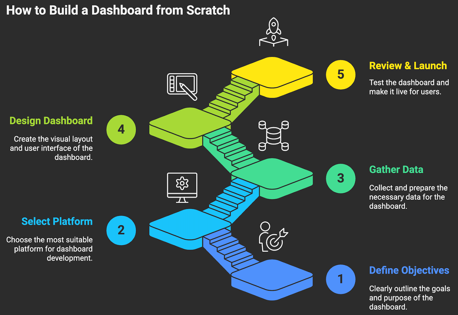
STEP ONE: DEFINE YOUR OBJECTIVES
If you cannot tie a chart to a decision, remove it. Before any tool choice or data work, get crystal clear on why you are building a dashboard and who will use it. A C suite view to steer growth is not the same as an operations view to manage SLAs. Anchor the design to a small set of outcomes and the decisions that will change those outcomes.
- Identify primary users and decisions. For each audience, list the top five decisions the dashboard should inform. Example: CFO, adjust hiring and spend based on ARR, cash runway, and pipeline coverage.
- Translate decisions into questions. Example, are we on track to hit net revenue retention of 115 percent by Q4?
- Define KPIs and leading indicators. Pair an outcome metric with drivers. Example, outcome, monthly recurring revenue. Drivers: win rate, average deal size, sales cycle, expansion bookings.
- Set targets, thresholds, and review cadence. Document green, yellow, red bands and how often each metric is reviewed, daily, weekly, monthly.
- Write metric definitions. Name, formula, data source, owner, refresh frequency, business meaning. One page, plain language!
- Decide actions and owners. For each KPI, document who acts and what action they will take when thresholds are hit.
- Use a balanced set of measures so you do not optimize one area at the expense of another. The Balanced Scorecard is a useful framing to align KPIs with strategy across financial, customer, internal process, and learning dimensions (Harvard Business Review, classic strategy framework).
- Guard against Goodhart’s law, when a measure becomes a target, it can cease to be a good measure. Pair targets with behavior checks and audit trails (overview, Wikipedia entry on Goodhart’s law).
Examples of aligned KPI sets:
- Revenue leadership, ARR, net revenue retention, pipeline coverage, sales velocity, CAC payback.
- Customer success, logo retention, expansion rate, time to first value, SLA adherence, CSAT or NPS.
- Operations, throughput, first contact resolution, backlog age, utilization, on time delivery.
STEP TWO: SELECT YOUR DASHBOARD PLATFORM
The right platform depends on your data estate, security needs, and how people will consume insights. Consider the decision criteria first, then match tools to fit. Prioritize governance, performance, and adoption over novelty.
- Map core requirements, cloud stack fit, direct query vs cached extracts, embedded analytics, row level security, SSO, version control, self service authoring, mobile, and accessibility.
- Estimate scale, number of creators vs viewers, dataset sizes, concurrency, refresh patterns, near real time needs.
- Assess governance must have: semantic layer, metric versioning, data lineage, audit logging, and permission models.
- Check total cost of ownership, licenses, compute, data egress, admin overhead, training. Do a three year TCO, not just license price.
- Pilot two finalists with your real data and three target use cases. Measure time to first value, performance, and stakeholder satisfaction.
For context on market leaders and capabilities, see the Gartner Magic Quadrant for Analytics and BI Platforms for a comparative analyst view (Gartner research, vendor landscape and evaluation criteria).
Two practical checks before committing, test direct query or live connection performance on the largest expected dataset, and validate row level security behavior for your most sensitive audience using vendor docs and a pilot model (Power BI direct query overview, Microsoft docs; Looker access filters, Google Cloud docs).
STEP THREE: GATHER AND PROCESS YOUR DATA
A dashboard is only as good as its data. This step means collecting from every relevant source, validating accuracy, and shaping the data for analysis. Expect most of the effort here, and embrace it. Bad data is expensive, and it compounds. HBR estimated the cost of bad data at roughly 3 trillion dollars annually in the U.S., a reminder to invest in quality early (Harvard Business Review analysis, cost of bad data).
- Inventory sources. CRM, product analytics, billing, ERP, marketing, support, data warehouse. Document tables, refresh cadence, owners.
- Define the metric logic. For each KPI, agree on the calculation, grain, filters, and time boundaries. Write tests for edge cases.
- Choose your landing zone. Centralize in a warehouse such as Snowflake, BigQuery, Redshift, or Azure Synapse to decouple compute from storage and enable governed modeling (vendor docs provide architecture patterns).
- Set up ELT pipelines. Use managed connectors like Fivetran, Stitch, or Airbyte to extract and load. Favor ELT into the warehouse, then transform there for scalability (Fivetran docs, managed ELT patterns).
- Model for analytics. Create star schemas, facts and conformed dimensions, to keep queries fast and definitions consistent (dbt documentation on dimensional modeling).
- Clean the data. Deduplicate, standardize date and currency formats, unify IDs, handle missing values, and document any imputations.
- Implement data quality tests. Row counts, null checks, uniqueness, referential integrity. Tools like Great Expectations or Soda make this repeatable in CI (Great Expectations docs, open standard for data quality).
- Add observability. Monitor freshness, volume anomalies, and schema changes so you can catch breakage before executives do (Monte Carlo overview, data observability best practices).
- Protect sensitive data. Apply column masking or tokenization for PII, and enforce least privilege. Align with GDPR and similar regulations where applicable (EU GDPR site, regulatory reference).
- Create a semantic or metrics layer. Centralize metric definitions in .dbt metrics, Looker models, or a dedicated layer like Cube so every dashboard uses the same logic.
Write everything down. A short data dictionary and a metrics catalog save countless cycles later.
STEP FOUR: DESIGN AND BUILD YOUR DASHBOARD
Start with a sketch. Paper or a quick wireframe in Figma or Whimsical is enough to force choices about hierarchy and flow. Aim for one screen that answers the core questions, then allow drill downs. Make the most important data obvious at a glance.
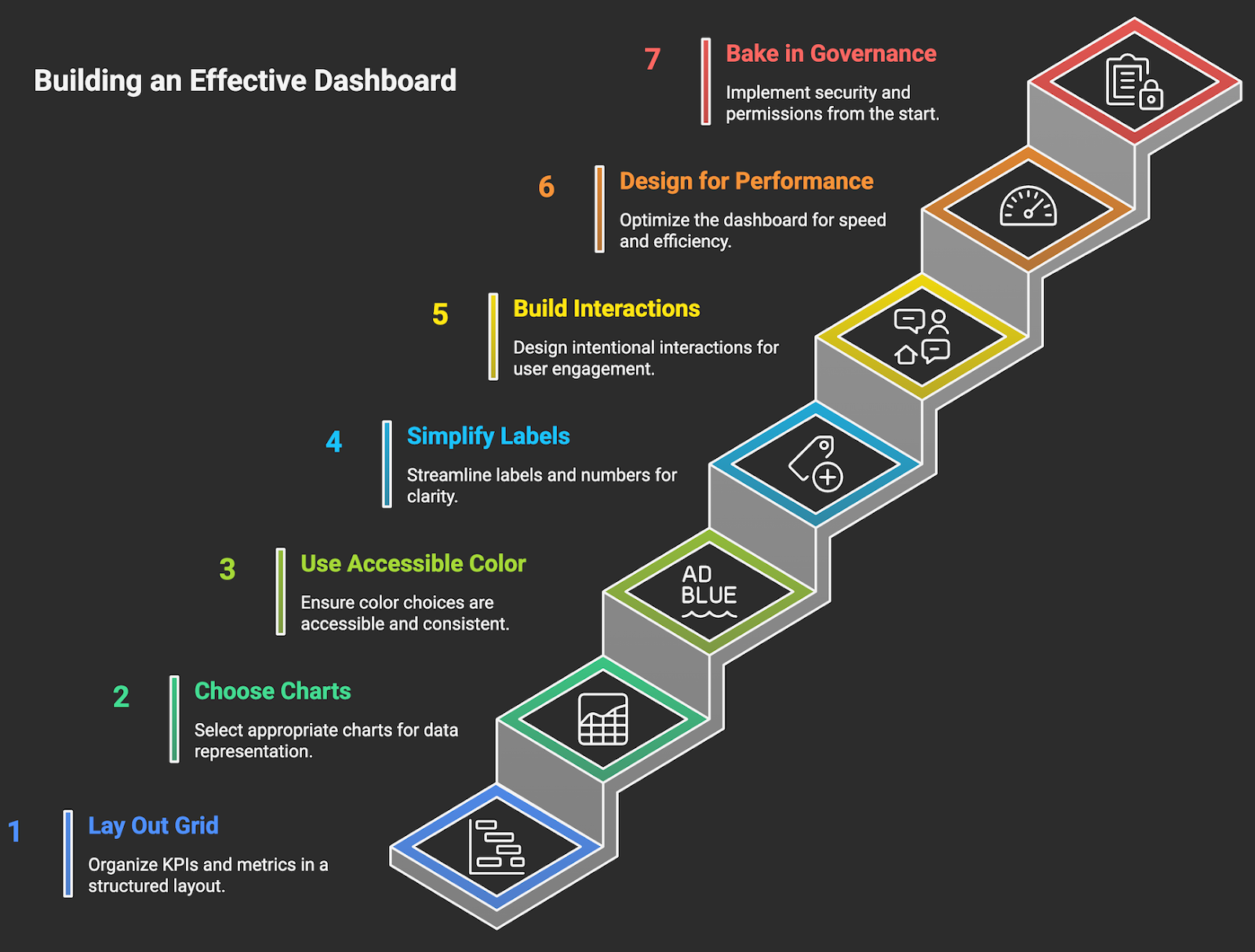
- Lay out a simple grid. Top row, north star KPIs with targets and trends. Middle, driver metrics. Bottom, diagnostic views and tables for detail.
- Choose the right chart for the job. Bars for ranking and comparisons. Lines for trends. Scatter for relationships. Avoid pie charts except for simple part to whole with a few categories.
- Use consistent, accessible color. Reserve a primary highlight color for action, use neutrals for context, and ensure contrast meets WCAG 2.1 standards of at least 4.5 to 1 for text (W3C WCAG guidance, accessibility standard). Remember that roughly 8 percent of men are color blind, so avoid red and green as the only signals (Colour Blind Awareness, prevalence data).
- Simplify labels and numbers. Use units, K, M, B, fixed decimal places, and consistent date formats. Add clear tooltips for definitions and formulas.
- Build interactions intentionally. Global filters for time, segment, region. Drill through to detail. Keep the number of controls small to reduce cognitive load.
- Design for performance. Limit visual count per page, pre aggregate where possible, and cache extracts if your platform supports it. Test the longest running queries.
- Bake in governance. Apply row level security and object permissions from the start. Use folders or projects with clear ownership.
Two quick reference guides to keep on hand during design, the Financial Times Visual Vocabulary to match questions to chart types, and usability guidelines for dashboards to avoid common traps like over decoration and poor hierarchy.
STEP FIVE: REVIEW, TEST, AND LAUNCH
A disciplined review prevents trust destroying surprises after launch. Ship a small pilot, validate everything, then scale.
- Data accuracy checks. Reconcile every KPI to a trusted source on a fixed date. Document any deltas and agree on the source of truth.
- User acceptance testing. Recruit 6 to 10 stakeholders across roles. Give them tasks, watch them work, and capture friction. Fix before rollout.
- Performance testing. Time to interact under typical load, run worst case filters, and set targets for acceptable query times. Optimize models or pre aggregations as needed.
- Security and permissions. Validate row level security with real user accounts. Review the permission matrix and audit logs. Test offboarding.
- Accessibility and mobile. Check color contrast, keyboard navigation, and small screen layouts. Ensure the most critical views are usable on a laptop and tablet.
- Documentation and training. One page guide with who the dashboard is for, key questions it answers, definitions, and how to request changes.
- Monitoring and SLOs. Set service level objectives for data freshness and availability, and alerting for pipeline failures and stale data. Borrow from SRE practices to keep reliability explicit (Google SRE book, SLO best practices).
- Launch with feedback loops. Announce, train, and collect feedback in the first two weeks. Maintain a backlog and a monthly release cadence.
BI projects that pair good governance with usability achieve faster adoption and better ROI. For example, a commissioned Forrester study reported a 366 percent ROI over three years for organizations adopting Power BI, largely from time saved and better decision making, a useful proxy for the value of well governed dashboards in general (Forrester TEI study summary hosted by Microsoft, ROI and payback assumptions).
READY TO CREATE YOUR FIRST DASHBOARD?
You now have a clear path for how to build a dashboard that drives decisions. Define the few outcomes that matter, select a platform that fits your stack and governance needs, invest in clean data and a shared metrics layer, design for clarity and accessibility, and launch with testing, monitoring, and training baked in. Do this, and your dashboard becomes an operating system for the business, not a monthly chore.
Need a partner to accelerate this work and guarantee measurable ROI? Makeitfuture designs and ships production grade dashboards and intelligent automations that reduce manual effort, improve decision speed, and scale with your data.
- Rapid discovery to first value in weeks, not months.
- Modern data stack implementation, ELT, dbt, governance, and observability.
- Executive quality design with accessible, action oriented UX.
Book a session to scope your first use case. We will help you turn metrics into money, quickly and safely. Explore our automation services or check out our case studies.


.png)
.png)
.png)